I create maps for any interface, from a wide range of data sources. Static maps, maps for mobile, interactive web maps, augmented reality, drone maps and more. See examples and explanations of each below. Loading...Loading...Loading...there is a lot to see...
everything is spatial
Maps
Maps are broadly organized by data collection type or geovisualization interface.
Here I share a wide range of map types, visualization techniques, all generated from different open data sets. Scroll through to find something that interests you. My publications and teaching materials cover each of these in more detail. All but two of the examples are interactive. Enjoy your visit! There is a lot to see...and a lot to load on this page.
Mobile maps can be used for both spatial data collection and information dissemination. Read more about technological considerations related to “Mobile Devices” and about “Mobile Maps and Responsive Design” both entries I authored/co-authored in the University Consortium for Geographic Information Science (GIS&T) Body of Knowledge.
Here you can use the time slider to view changes in urbanization, nightlights, in Aruba from 2014-2024. Click any pixel and see the value change and the lat long in the legend.
Interactive web maps are becoming the norm. I have experience in developing a wide range of different online mapping interaction techniques. Some tools are straight out of the black box Mapbox (like the one above) using JavaScript libraries and APIs. Before any mapping project, it is important to identify the communication goals rather than plan the flashiest map. Can you guess what my communication goal is here?
Static maps will always be relevant. The aim of a static map is to quickly and easily communicate a clear story. The cartographer should do the work for the reader. More tips and tricks about good cartographic principles please download my open-access book Mapping for a Sustainable World. Did you know you can make static maps with Microsoft Excel 2016? I make static maps mostly using QGIS.
The Modifiable Aerial Unit Problem is illustrated in this interactive example showing the Sustainable Development Goal Indicator 15.1.1 Forest area as a proportion of the total land area reported in the year 2000 by country and by regions. What patterns change based on the aerial unit?
Sentinel 2 is a multispectral sensor offered by the European Union. Above are the ABC islands, Aruba, Curaçao, and Bonaire (from left to right or west to east). You can toggle on and off layers to see the differences between short wave infrared, infrared, true color and NDVI in 2021. Remote Sensing has always and will always produce big data. Google Earth Engine is a tool for big spatial data wrangling. I have led several student projects related to monitoring change over time related to carbon emission, carbon sequestration, forest cover change, and more. Remotely sensed satellite imagery is free, open-source, big data with countless research opportunities limited only by our imagination.
This animation shows the Median Normalized Difference Vegetation Index (NDVI) calculated from 16-day MODIS composites spanning January 1st through December 31st for the Year 2019. Dark = healthy vegetation. This shows the pulse of the planet growing seasons. Google Earth Engine is a tool for big spatial data wrangling. This map was created for the #30daymapchallenge in 2021 Monochrome.
Open data represent a new social experiment—a movement—based. Some proponents claim that open data will democratize data access and knowledge production, encourage transparent governance, strengthen democratic accountability, and ultimately advance cities socially and economically. Here are an example of open data. Castles in the Netherlands. Kelpr was originally built by Uber.
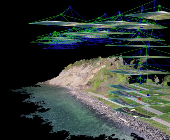
From 2014-2017 I did a lot of experimenting with drone imagery testing a wide range of structure from motion software packages. See a talk I gave at Dartmouth about the use of Drones for good.
ArcGIS Pro is proving to be a fun tool for 3D Geovisualization and animation. This is a flood simulation in a metropolitian area. The elevation around the city is colored to draw attention to the steep slopes that my bring rain quickly to the city.
Here is another animation at a different scale. This is Seattle, via Landsat imagery captured over time. Landsat bands 4, 5, 1 and uses the color red to represent healthy vegetation, black is water, green and yellow are different vegetation. The aim is to observe change over time in the Seattle metro region. Can you see the seasons change?
Scroll around this image. Browser based augmented and virual reality are now possible with 360 cameras and AFRAME whic is an open web framework for building 3D/AR/VR experiences. Above is an example of my experimentation with AFRAME. Can you tell I miss Seattle?
This is Barbados. Did you know Small Islands are the first to feel the effects of climate change but contribute the least emissions contributing to it? Barbados is doing a lot to call international attention to all small island states.